
As web designers, we are always looking for creative and innovative ways to improve the visual aspect of a website to enhance the user experience.
From the font type, text spacing, and size to the color structure of HTML elements and graphics, a well-designed website will reduce bounce rates, improve conversions, and deliver a long-lasting impression of your business.
Before discussing which color schemes are the most trending in 2019, we first need to have a better understanding of color psychology and how it affects your site visitors.
The Psychological Impact Of Colors in Web Design
The color scheme of a website has a potent psychological effect on the minds of the visitors. Although, the study of the impact of color schemes and shades on the psychology of the visitor has not been completed to the end, yet there are some defining rules that are the basis of every color combination that is used in the world of web design.
Related: Content Creation Process For Web Design
So as to avoid making mistakes in the use of specific colors in web design, learning about their impacts and dwelling on this information is a must.
There is no stipulated, single recipe that can announce success for your web page in the field of web design as far as the use of colors is concerned, however having a clue about the classical associative series regarding the different shades and colors can prove to be a huge benefit while choosing the perfect colors for your webpage.
Perceptions vary with cultures
It is a scientifically proven fact that people from different cultures react differently to certain colors. It is their preconceived notions, social upbringing and difference in perceptions that make them react differently to the same color as compared to a person from another culture.

There is a large amount of data and research in color psychology and how it influences emotions and perceptions of human behavior. In order to make use of this data correctly, It’s essential to define the target market for your site.
Factors such as culture, location, and age influence how site visitors perceive and interact with your webpages. For instance, the color yellow is used to express happiness and warmth for most parts of North America, while Latin America sees yellow as a sign of sadness, sorrow, and mourning.
Related blog post : Web design resources for graphic designers, developers, and marketing creatives.
Colors can have a significant impact on business and brand perception. In the following color selections, we analyze the main pros and cons to help you master the art of web design colors.

Color Red in Web Design
In web design, the color red is widely used in user interface actions that involve actions, emergency, vulnerability, and risk. Deleting content from the database, alerting the user of an irreversible action, or submitting a form are some examples of uses of the color red in web design.
Red is a color that attracts the most attention. Use it cautiously to avoid high bounce rates, bad user experience, and underperforming user interactions.
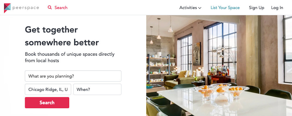
Use milder shades of the color to improve UX/UI and prevent hostility in users and force actions to increase conversions. Peerspace, a platform for booking space for events, photoshoots, and video productions, successfully uses a red-like hex color for primary webpage actions.
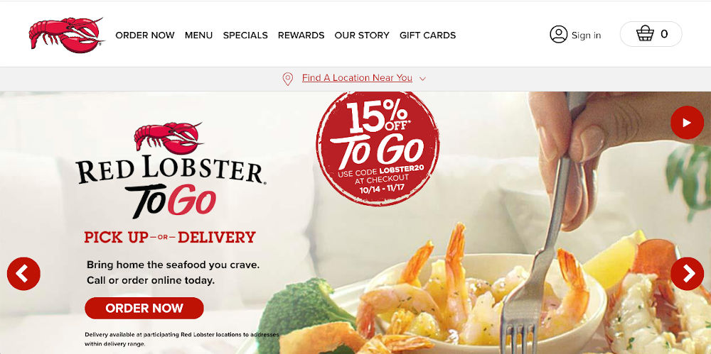
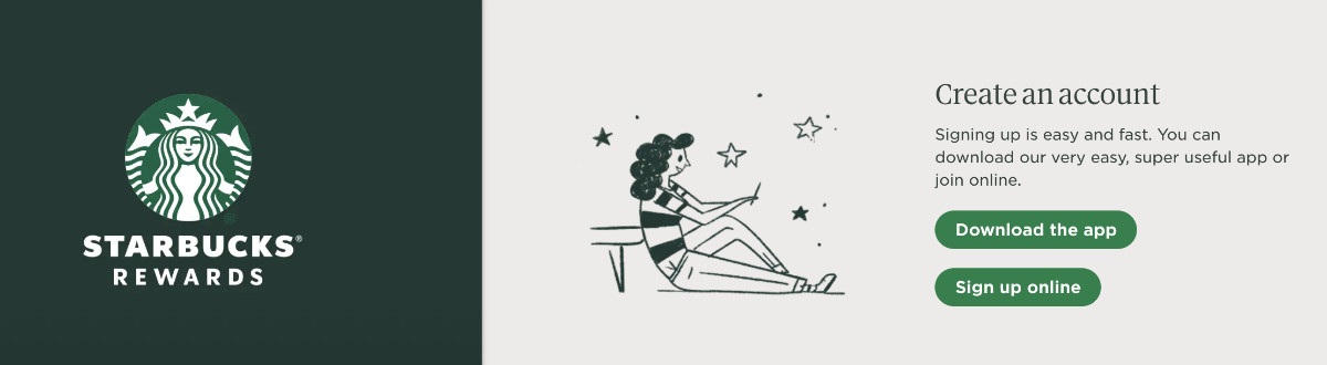
Red is provocative, attractive, and bold. Appropriately used, it conveys the correct message to site visitors. Red Lobster successfully applies the right amount of red-colored elements mixing together with black and white bold elements.
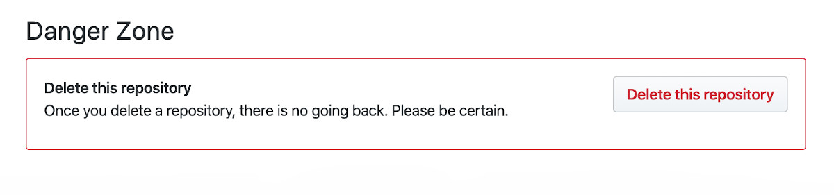
Red is perfect for conveying the message of danger. Web platforms like github.com, a code repository for web developers, make use of the color red in sections, buttons, and links to warn of dangerous actions.
Highlights of red in web design
- Red mixes great with white and black – Hello Netflix!
- Red is the greatest attention-grabber, use it for alerts, critical system status, and CTA’s.
- Red symbolizes danger, use it properly.
- Red is a great choice for dating, car, holiday, and food sites.

Color Orange In Web Design
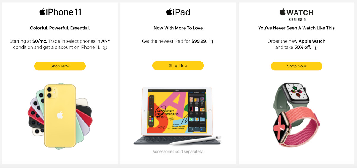
Orange is a color of energy, youth, and movement – Orange is a color that can be associated with encouragement, and stimulation. Orange shades are often used in web interfaces as call to actions (CTA’s) to improve conversions.
In the following example, there are two different orange shades which can be interpreted by the user as two separate actions – which they are.
In the US, surveys show that orange is the color most associated with activity, energy, and warmth. Orange is commonly used in user interfaces that require action because of its visibility and its association with danger.
Orange represents a big statement without the same urgency as red does. The following webpage section promotes action with the orange link and the orange button. Orange and blue is an excellent combination of colors not only in web design but in general.
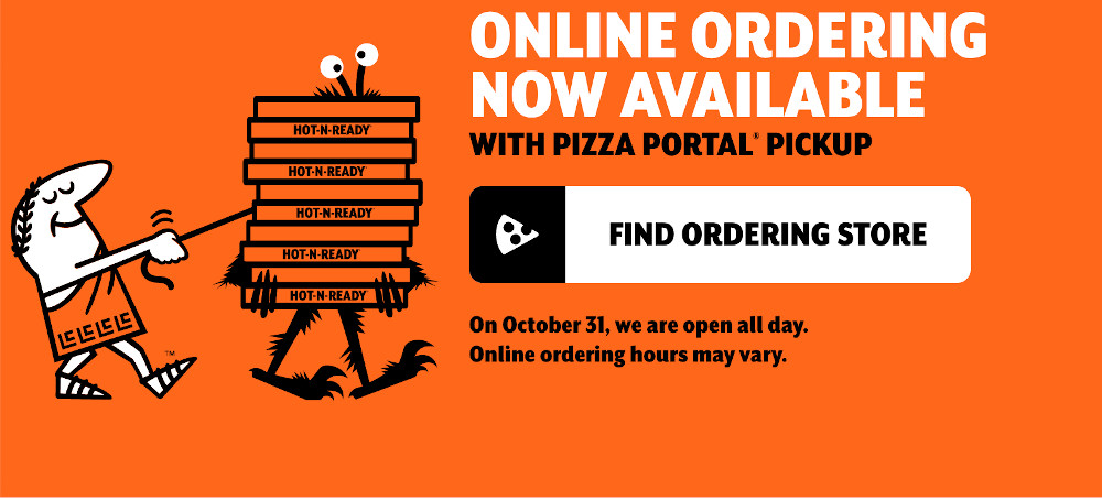
Don’t go overboard with orange. Our folks at Pizza! Pizza! (Little Caesars) plastered their website with orange even as a background color (as of fall 2019), making it difficult to draw attention to specific and essential website actions.
Orange is a great color to attract attention without annoying anyone if it is used strategically. Home Depot adequately applies orange without being too overpowering.

Highlights of Orange in web design
- Orange represents encouragement and stimulation.
- Orange is great to attract attention.
- Orange mixes great with blue and black.
- Too much orange can suggest cheapness.
- Orange is a great choice for beverage, business, sport, and food sites.

Color Yellow in Web Design
Yellow can be associated with warmth universally – Yellow is a positive color that is associated with joy, happiness, intellect, and energy. Yellow is known to stimulate mental activity. In web design, yellow is used in call to actions, buttons, highlighting text, and warning messages.
Yellow is an attention getter, often used in buttons, CTA’s, and to highlight text. Sprint usually combines their primary color which is yellow with white and black.
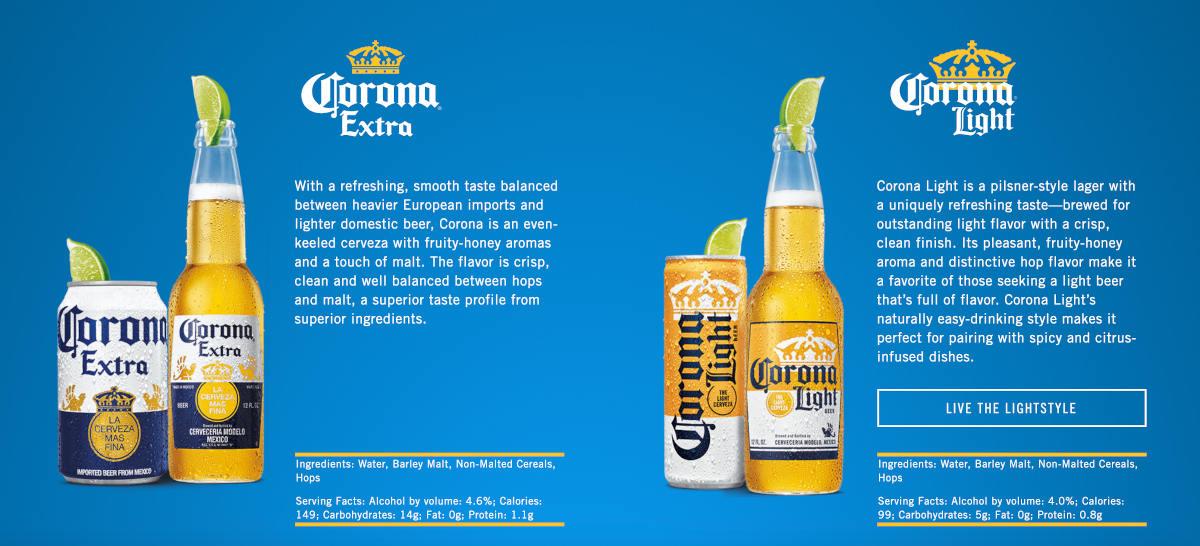
Yellow mixes great with green, black, and blue. Yellow generates a warming effect and incites cheerfulness. Cerveza Corona applies yellow and blue in the right amounts, which is comfortable on the eye.
When yellow is overused, it may cause a disrupting effect. Use it in conjunction with white, black, and other shades to find a balanced visual effect.

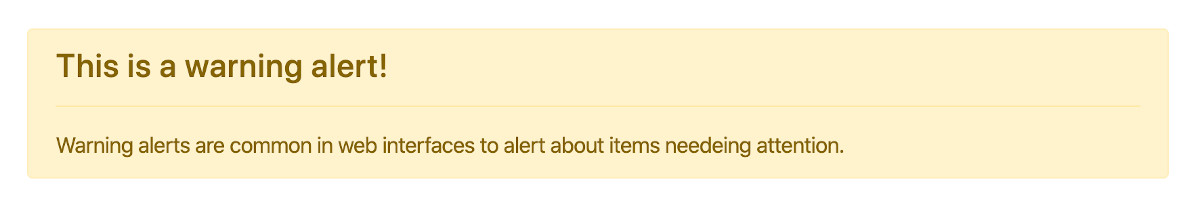
Yellow is commonly used for warning alerts and messages in web interfaces. A warning alert indicates an item needing attention. A software update, unpaid invoice, database backup are some examples of warning alerts.
Yellow is associated with happiness, enthusiasm, and energy. Educational and entertainment websites often use this color.
Highlights of Yellow in web design
- Yellow represents happiness, enthusiasm, and energy.
- Yellow is an attention getter.
- Yellow can be used for highlighting text.
- Yellow mixes great with blue, black, and green.
- When yellow is overused, it may cause a disrupting effect.
- Yellow is commonly used for warning alerts and messages.
- Yellow is a great choice for enterteinment, children, travel, and business sites.

Color Green in Web Design
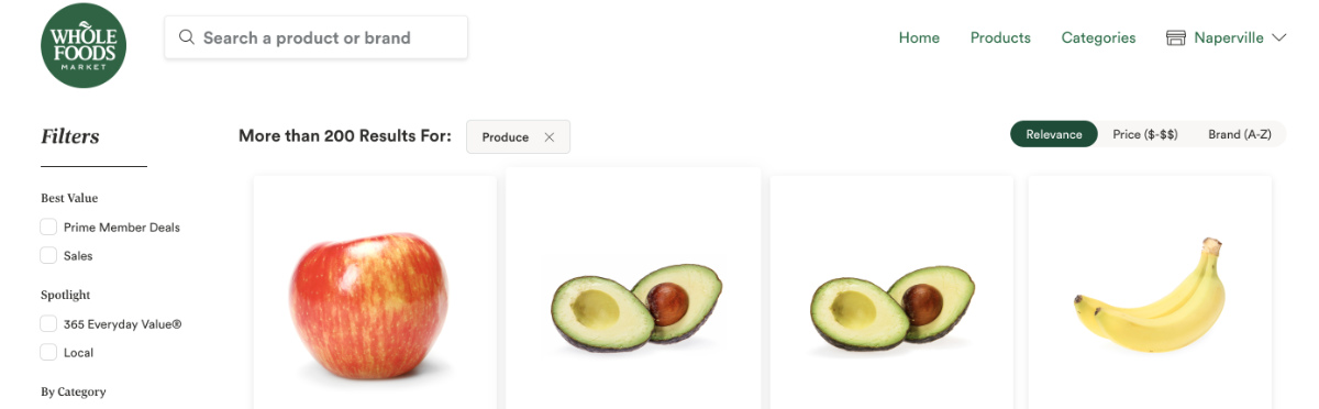
Green is a color that embodies calmness and stability and is an ideal choice for companies that would like to symbolize those emotions. Choose green for calm, relaxation, and positive emotions.Uses of green in web design include buttons, CTA’s, banners, text, success alerts, and messages. Green suggests the idea of moving forward, use it for sign up, register, or add to cart buttons.
Green is the second most used color in web design after blue. Green represents optimism, safety, growth, and balance. Shoppers tend to be more relaxed when purchasing from a green online store or website.

Financial institutions, environmental, and agricultural companies would find this color to be a perfect choice.
Green provides a substantial calming effect. Depending on the shade, green can be associated with wealth, positivity, relaxation, and harmony.
Green is ideal for promoting natural, safe, organic, and environmentally-friendly products.
Green is perfect for business, food, agricultural, financial, advertising, and energy sites.

Green color is known to indicate safety or success. Green is widely associated with a positive outcome. An order successfully placed, a website task completed or successfully uploading a file are common uses of the green color in user interfaces.
Highlights of Green in web design
- Green represents optimism, safety, growth, and balance.
- Green is associated with positive outcomes.
- Green maximizes readability.
- Green mixes great with orange, yellow, and blue.
- Green is commonly used for buttons, banners, success alerts and messages.
- Green is a great choice for financial, environmental, and agricultural companies.

Color Blue in Web Design
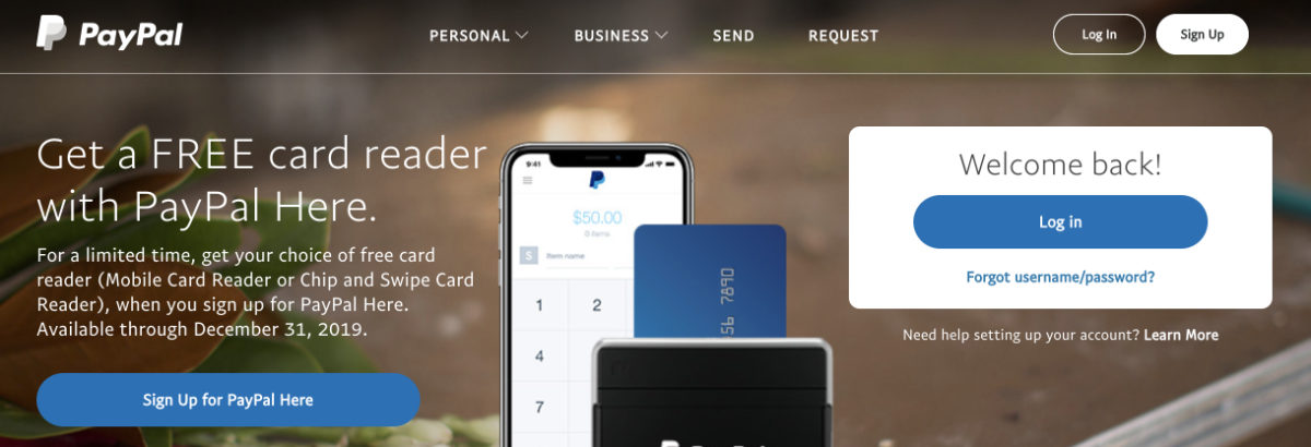
Blue is a color that can be associated with transparency, trust, tranquility, safety, and security. Companies like Inova, Twitter, Chase Bank, Paypal, and Facebook have successfully made use of many shades of this color to create a robust digital marketing strategy.
Blue is the color of trust. As a color of confidence and trustworthiness, banks and financial institutions implement blue colors into their web designs and marketing campaigns.
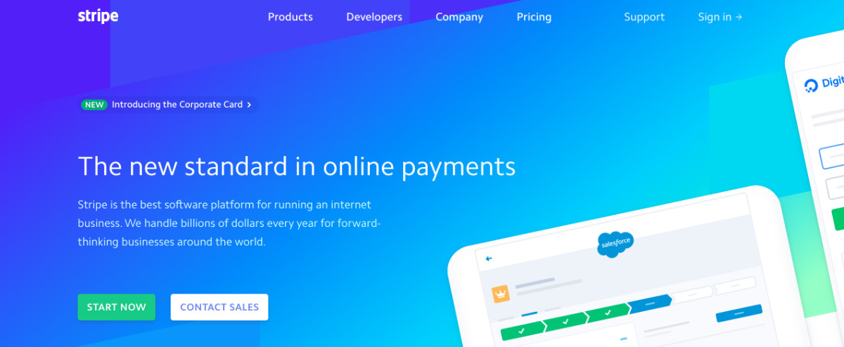
Blue is the most used color in web design. The top-ranked websites in the world use shades of blue to style their websites. Google, Stripe, IBM, Walmart, and Twitter are just some examples of companies that incorporate blue into their UI’s.
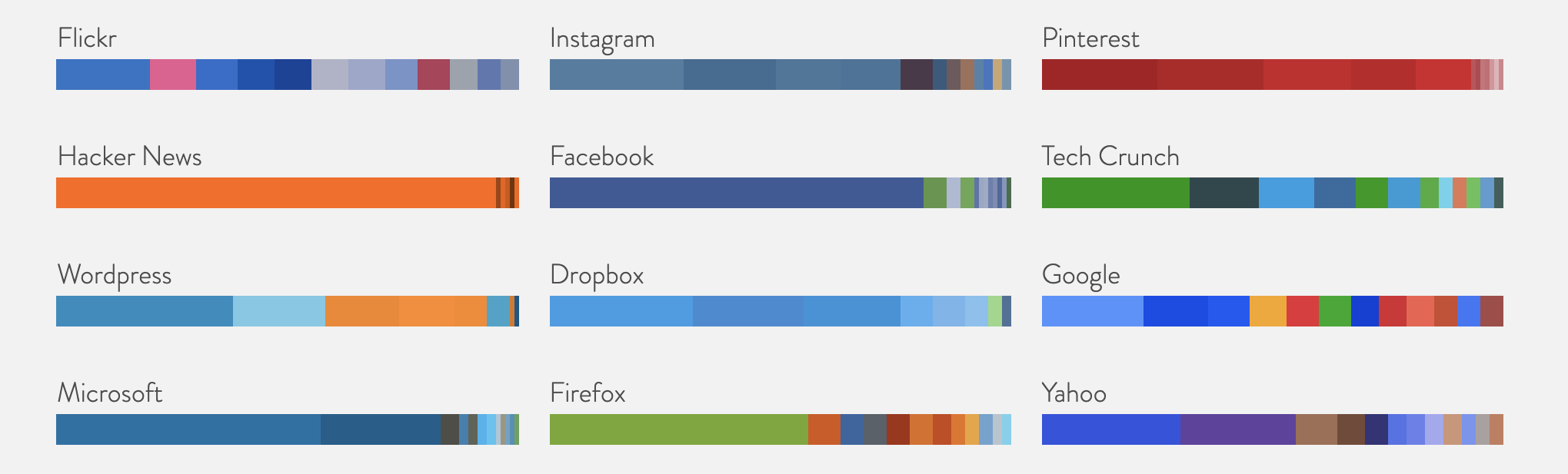 Top colors used in the top websites.
Blue displays authority and confidence without being too aggressive. Companies in the technology, financial, and e-commerce fields use blue as a way to show these emotions.
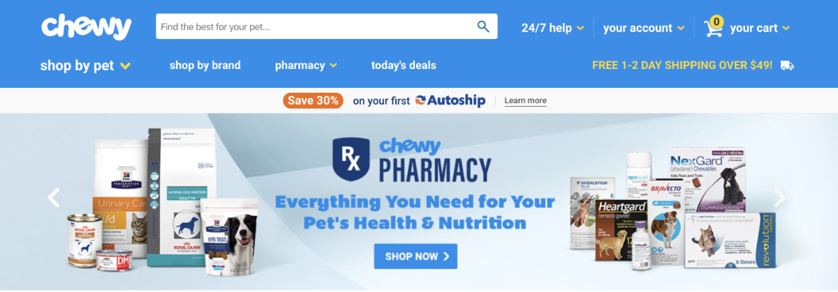 Blue color ecommerce website.
Blue is known to decrease appetite. Minimize blue colors in restaurant and food-related websites. Diet experts suggest eating food off a blue plate to minimize eating.
Blue is the default color for links and informational alerts.
Highlights of Blue in web design
- Blue represents dependability, serenity, intelligence, and confidence.
- Blue is associated with security and trust.
- Blue is the top choice color in web interfaces.
- Blue color is the default choice for hyperlinks and informational alerts.
- Blue combines with red, yellow, orange, brown, and green.
- Blue is an excellent choice for technology, financial, eCommerce, and business websites.
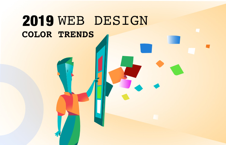
Top color trends in 2019
The following segment of this article aims at giving you an insight into the various color trends that will prove to be most important in the year 2019.
What are the trending colors in web design for 2019?
The top colors for 2019 are Blue, Purple, Green, Gray, and Black.
Web Design Trends for 2019
Black Color
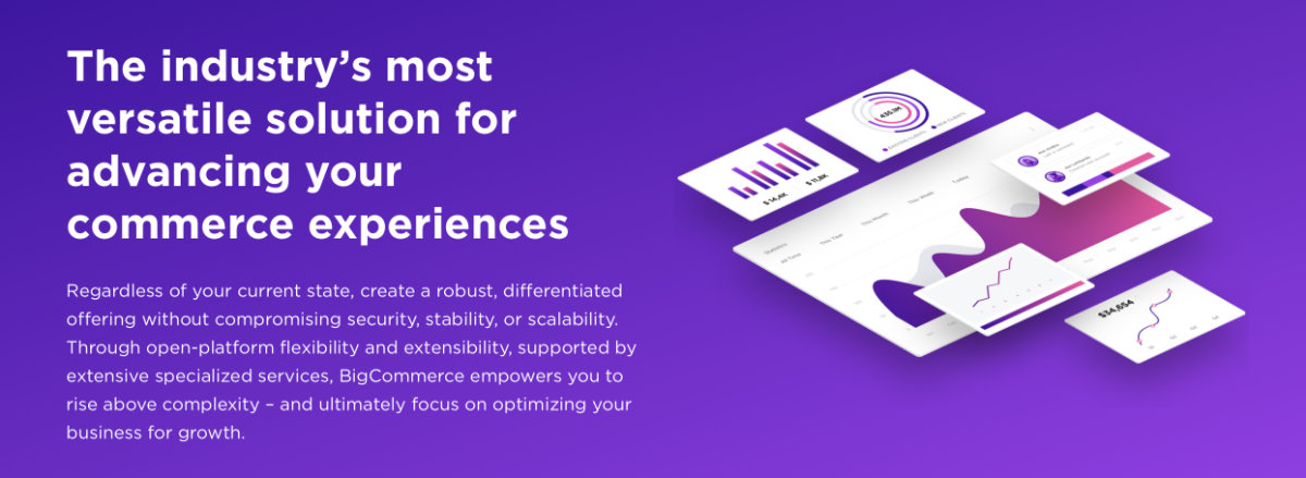
Right now, the color Black is trending, and companies like Godaddy, Bigcommerce, Invisionapp, and Intercom have implemented it in their user interfaces.
 Bigcommerce incorporating dark colors in landing pages.
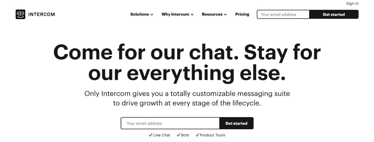 Intercom using black color in web interfaces.
Use of gradients
Gradients are making a significant comeback in the year 2019, and have already been in fashion, making appearances in 2018. This year is presumed to be the big year for this trend, which has made a graceful comeback, being used in overlays, illustrations, backgrounds, and even user interfaces.
 Usage of green and blue gradients in web design.
Pastel Colors
Pastel colors, also known as soft, neutral, milky, or washed out colors, are a growing trend in web layouts in 2019. Pastel colors take a minimal, elegant approach.
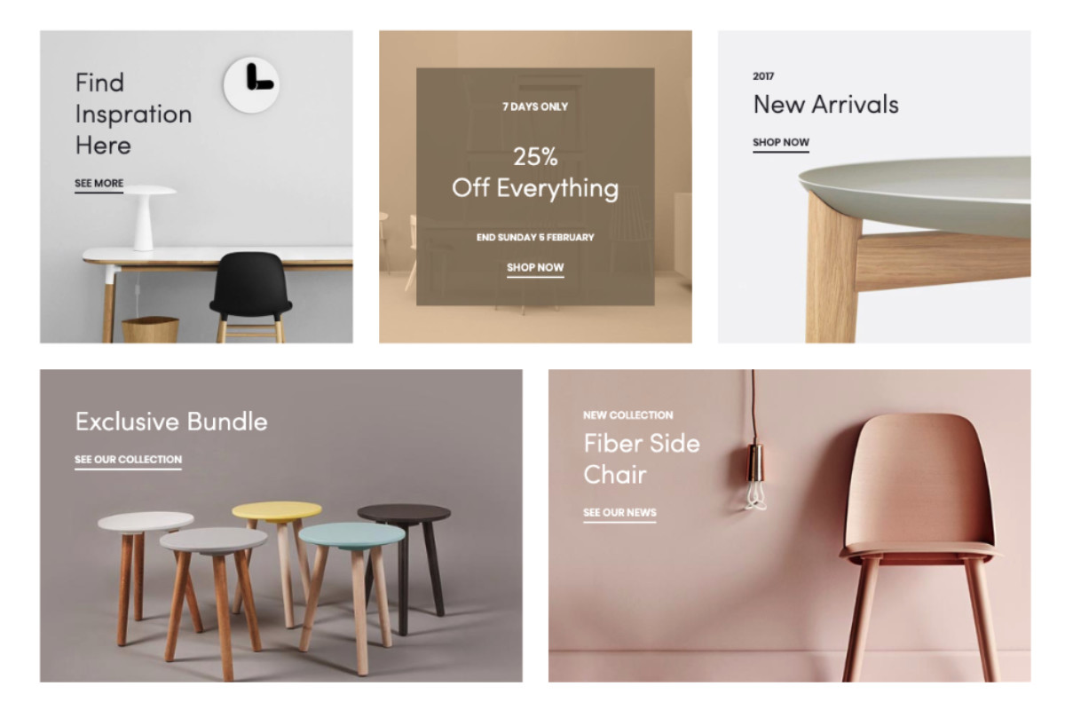 Pastel color example in web design.
Purple/Blue Shades
The trend of using color combinations that are bold and bright is just starting to gain momentum and is sure to find widespread application in the year 2019, with applications even in the sector of logo design. It has also been seen that apart from organizations making use of such bold colors, even customers are adapting well to these ongoing changes, thereby creating a demand for the use of such colors in web design.
 Shases of Blue and Purple in web design.
The problem of finding the perfect color combinations and best color trends to follow in the year 2019 has been made easier for you. Take our help at Inova to get the best solutions for your company as far as trending color combinations in web design is concerned.
Our professionals at Inova are highly trained in the theories of aesthetics and impacts of colors and color combinations on viewers and will help you choose the perfect color for your website, depending on your business niche and needs. Reach the zenith in your business and make use of trending colors on your site that leave a positive mark in the hearts and minds of the customers.